
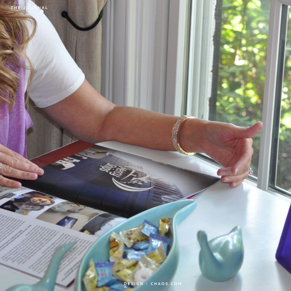
I started in print. Magazines, books, album sleeves, posters, marketing collateral. The kind of work that gets printed once and stays printed. Now most of what I make is on screens. And most of what I know about screens, I learned in print.
Print doesn’t get a redesign next quarter. Once the file goes to press, every typo is permanent, every decision is final and every color separation either works or doesn’t. There’s no “we’ll patch it Tuesday.” That permanence makes you obsessive about the parts a lot of digital designers learn to brush off. The hierarchy of one paragraph against another, and the way a headline sits on a baseline. Whether a photo has enough room around it to feel like a photograph instead of a placeholder. These aren’t precious concerns. They’re the difference between a piece that holds attention and a piece that gets glanced at and forgotten. Editorial design taught me that the second a reader feels the page is fighting for their attention, they leave. The same is true on the web, just so much faster.
A few things print taught me that I refuse to let go of on screen.
White space is content. The space around a thing is half of what makes it readable. Most websites fill empty space with another widget. Print designers know empty space is the widget.
Type isn’t decoration. It is the design. If your typography is right, you can take almost everything else away and the piece still works. If your typography is wrong, no animation will save it.
Restraint scales. You can always add one more thing. The discipline is choosing not to. Editorial deadlines forced that habit on me. The page is going to press at three. You either commit to the layout that works or you ship the one you can defend, and the one you can defend is almost always the one with one fewer element.
Files are handed off the way I’d want to receive them. Print taught me to set up documents knowing somebody else has to open them. Trim marks correct, bleeds correct, colors specified, the doc organized so a stranger could pick it up. That habit translated cleanly to web in the form of code commented, structure documented, hosting set up in the client’s name, the site handed off the way I’d want a site handed to me.
The crossover goes the other way, too. Web taught me that layouts can be systems instead of snapshots, and that grid logic and design tokens and rules-based composition are more flexible than any one fixed page. I bring that back to print all the time, especially in long publications where ten different layouts need to feel like the same magazine.
There’s a reason small businesses end up with four different brand styles when they hire four different specialists. The website agency makes the site. The social agency makes the posts. The print shop makes the menu. The SEO contractor builds links pointed at whatever copy ChatGPT wrote for them. Nobody is in charge of the through-line. Having print and web and social and SEO living in one head means the through-line is built in. Same voice, same type system, same color logic, same care.
That’s not a pitch. It’s the only way I’ve ever known how to work.
One designer, four crafts. Print and editorial, custom websites, social, and SEO….all from one desk, so the through-line is built in. Start a project, or read more about the studio.